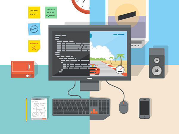
Software Engineer - UI/UX Designer - Game Programmer
About Deborah
Hi, I'm Deborah.
I'm a Computer Science student currently studying in National University of Singapore (NUS).
My interests lies in Software Engineering and creating Games! My hobbies includes working on software projects, playing computer games and drawing pixel art. I appreciate the artworks and skills used in creating of virtual environments and characters in games. The games I'm currently into right now are Overwatch, Warframe and Divinity Sins 2. These multiplayer video games allows me to escape from reality and have fun with friends!
I am a Developer and a Designer who enjoys creating and designing applications for people to use.
I am passionate about designing websites, mobile applications and games. Do check out my portfolio to see the past projects I've worked on!
You can view/download a pdf of my current resumé
here
.
Skills
I love developing and programming
Being able to tranform an idea into a usable working product excites me.
I enjoy the different development phases of a software project: researching, designing, coding, evaluting and testing.
Before starting on developing a project, knowing the scope and deciding on the most optimal architecture to use is the first step to take. I value readable, well-documented and simple code.
I appreciate products that has interfaces that are simple and easy to use. Designing a product that effectively solves a problem and suit the user's needs starts from going through the design thinking process. Through this process, research on the problem must be done well, and testing on our solution must be analysed well.
UX
User ResearchStoryboardingLo-fidelity PrototypingHi-fidelity PrototypingUsability Testing
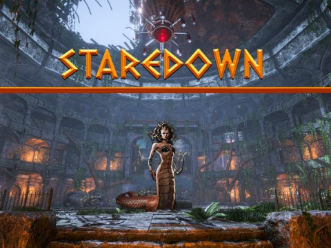
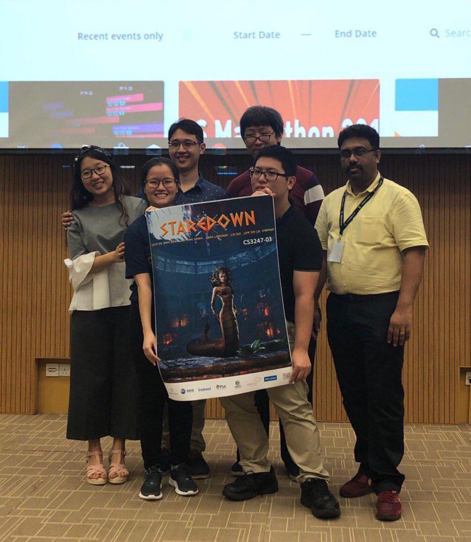
by Deborah, Leslie, LingShuo, Liu Rui and Yong Sheng
About
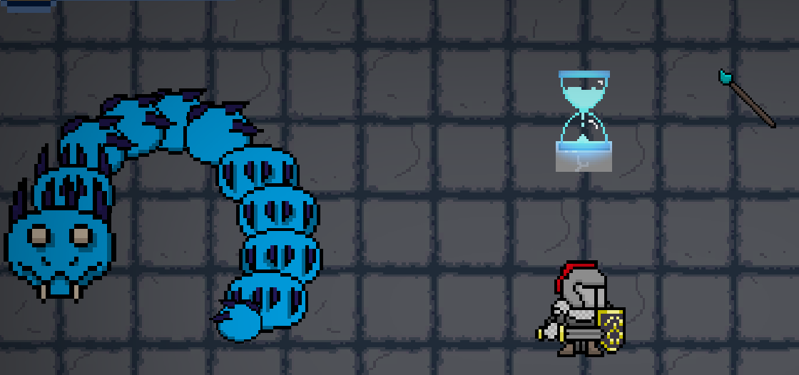
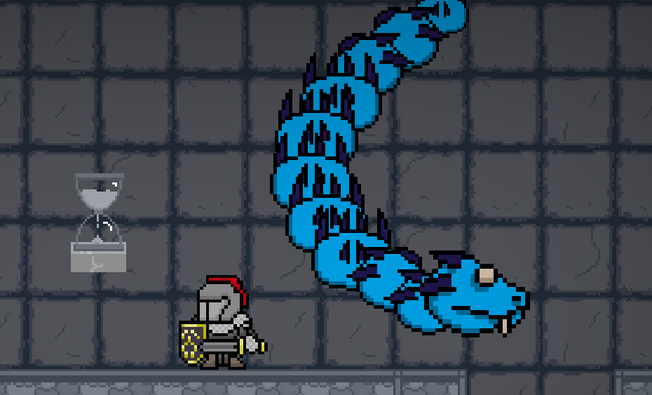
StareDown is a first-person VR survival game that takes place in Ancient Greece. Players assume the role of Medusa, Eldest of the Gorgons, who serve to seek vengeance on Poseidon by taking out on the Children of Poseidon for her injustice during the event unfolded in the Temple of Athena. Set in an arena setting, the player will contest hordes of Poseidon's armies till the last of Poseidon's acquaintance is wiped off from the face of the earth.
Players are given bows and arrows, spells and a teleportation utility weapon for them to survive as long as possible.
Contributions and Takeaways
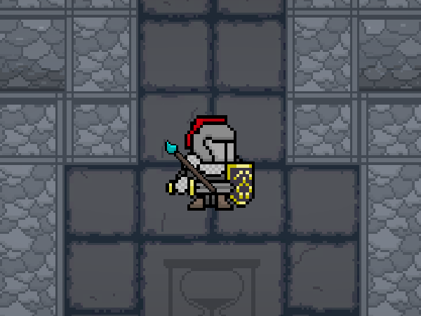
Staredown was created for my Game Development module (CS3247) in NUS, which won the Best Project Award for NUS 14th STePS.
My role was the Gameplay Programmer and did some AI Programming as well.
I created the tutorial portion of the game, integrating all components of the game into the tutorial.
Working on this project was definitely challenging in terms of the Virtual Reality component. Not only did we have to ensure the experience in VR was as we envisioned, we constantly needed the hardware with us to test out new features and find bugs.
However, it was the most fun and fulfilling game development project I've done! I'm extremely proud of Staredown and the friendships I've forged with my teammates.
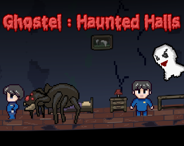
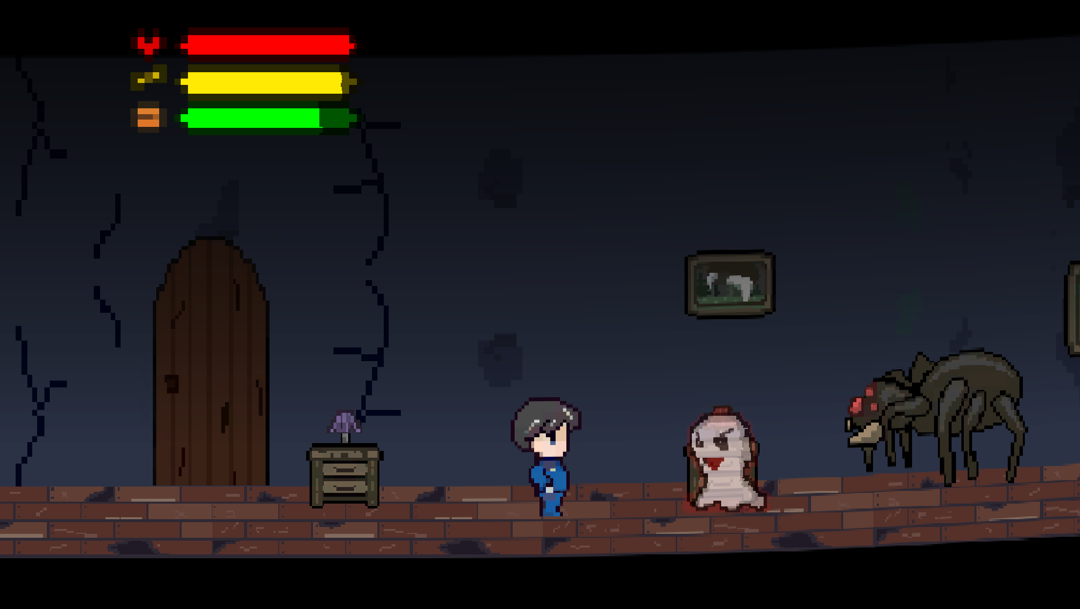
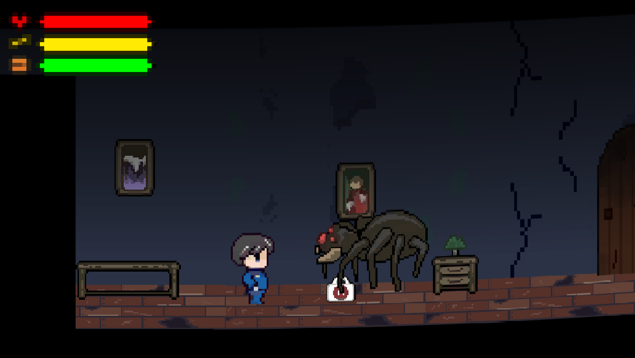
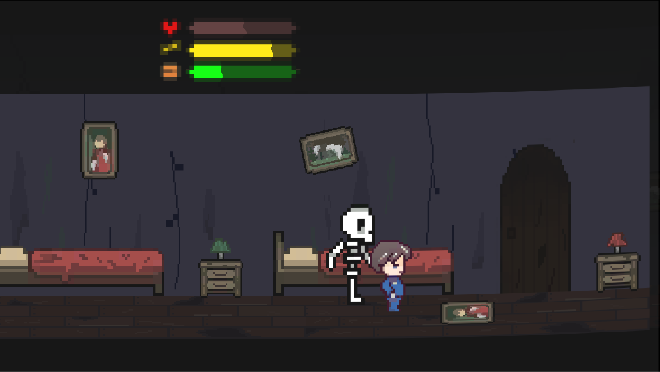
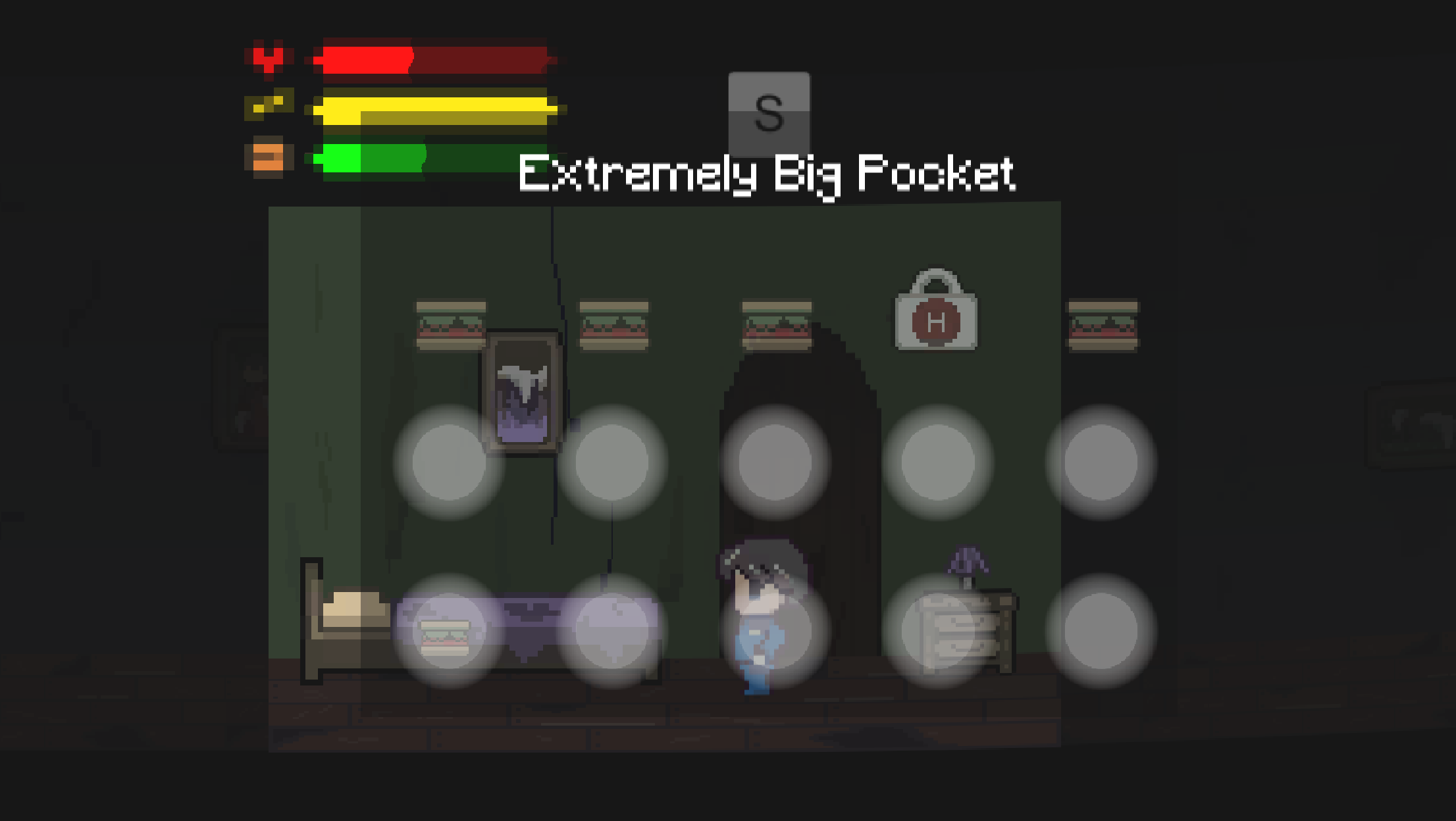
Ghostel : Haunted Halls is a spooky themed 2D survival game. You have to run through this haunted hotel and survive as long as you can!
This game was made for itch.io’s Weekly Game Jam 87, with the theme 'Inifinite Hallway'.
is a game made for Weekly Game Jam 87. The theme for this game jam was ‘Infinite Hallway’, and my team decided to make an Endless 2D side scroller game in Unity.
Contributions and Takeaways
My role was the Asset and UI Artist and did some Level Design.
This was my first ever Game Jam where most of the sprites, art and UI are made by me! With that said, there was A LOT of work to be done on the art side especially because I joined mid gamejam.
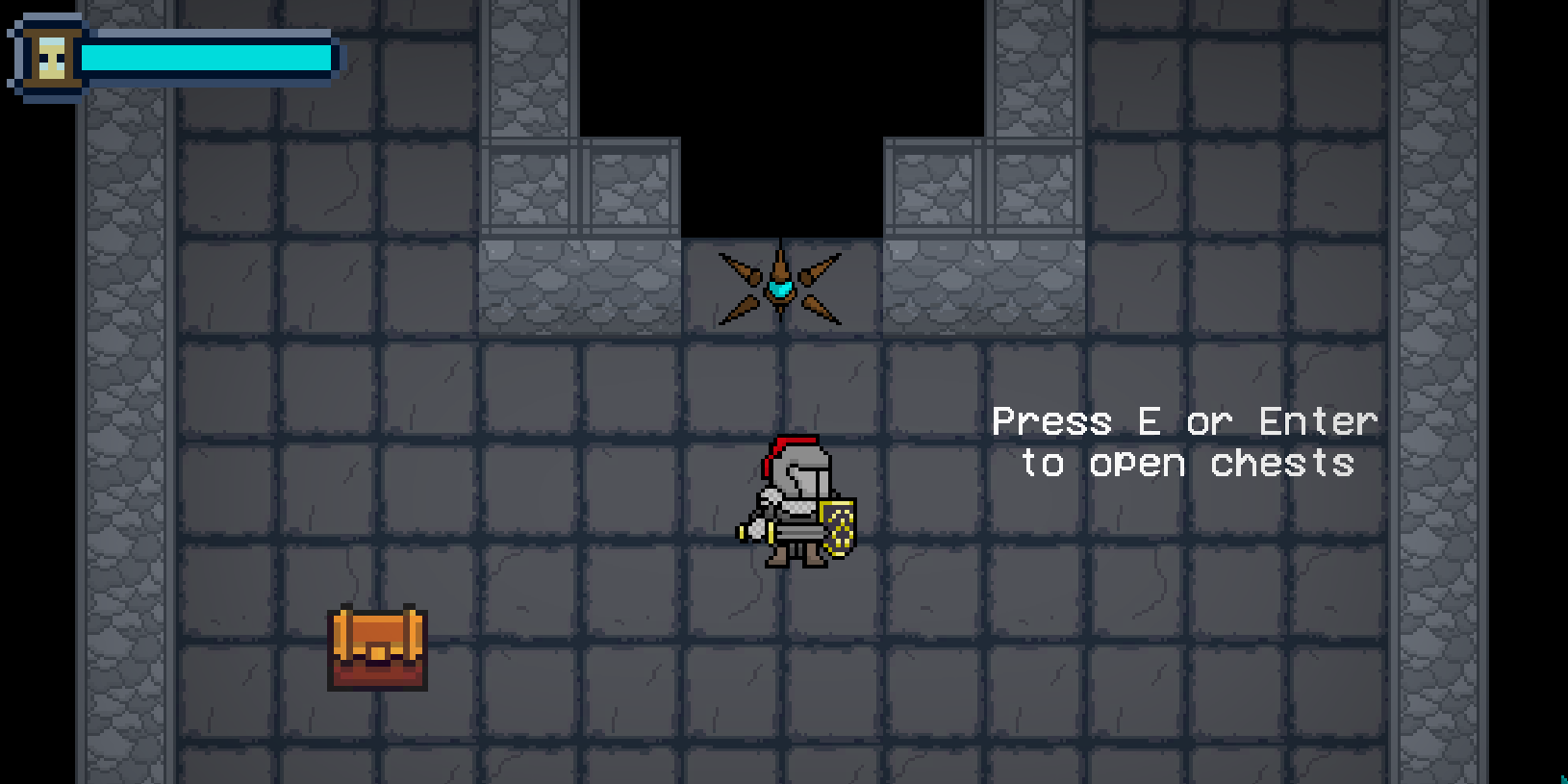
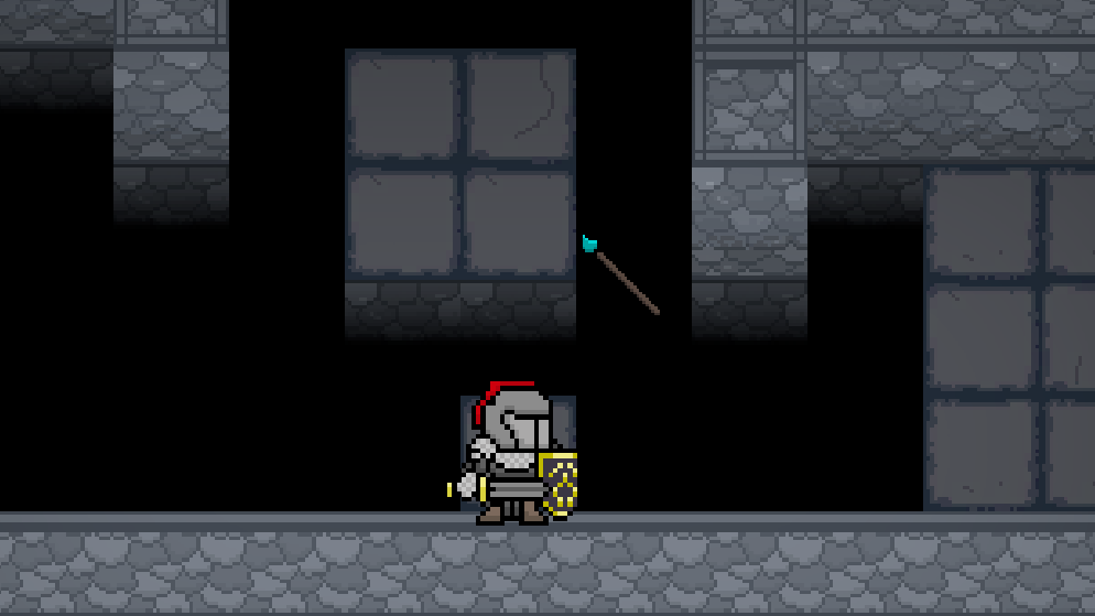
The Mighty Pen is a 2D game where you have to draw a circle around the enemies with your cursor to destroy them. Your goal is to explore around the map. A certain cycle of time is given for you to walk around the dungeon, fight enemies and finally defeat the boss.
This game was made for Weekly Game Jam 87, with the theme 'Inifinite Hallway'.
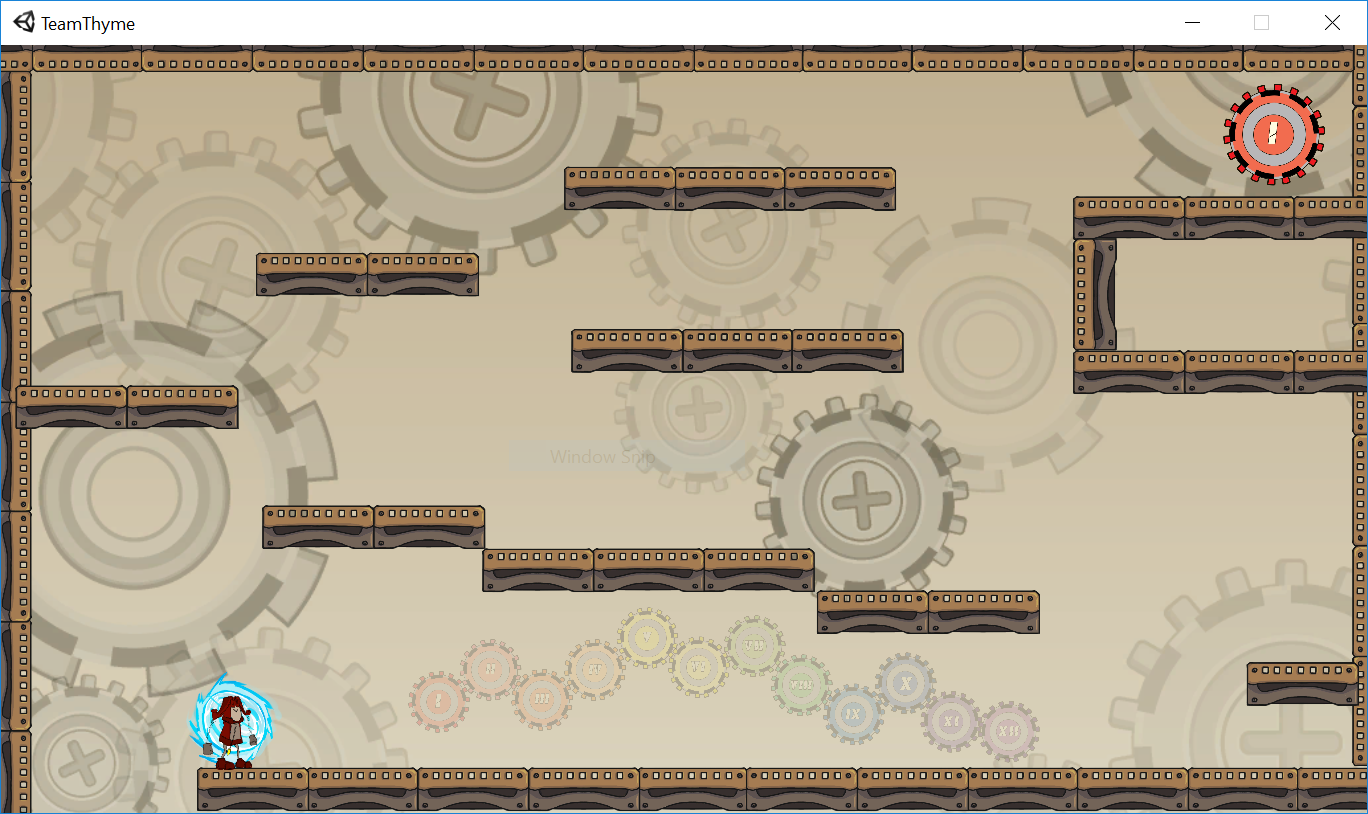
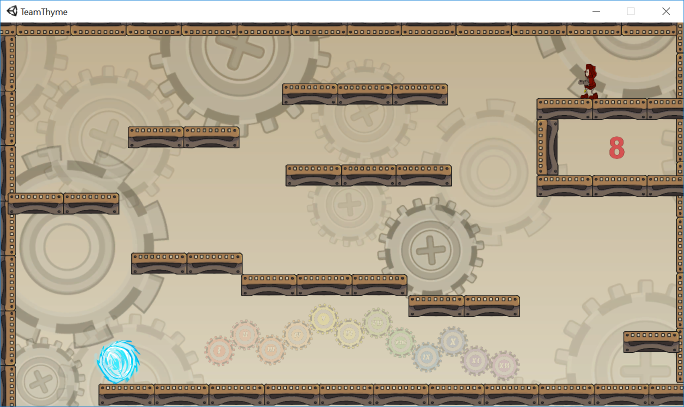
Gamecraft 2018 was my first ever hackathon and game hackathon I’ve participated in. It was a 24 hour game hackathon held at NUS. The theme for the event was Clockwork.
We eventually settled for a single-player 2D platformer game that has 12 levels, symbolising the number of hours on a clock. It is a game where the player plays in the same map, has the same goal, but for every level played an additional trap get introduced into the map.
I was the Game Designer for this project and did a little coding. It was also my first time working with Unity, hence it was quite intimidating yet fulfilling.
E game where you have to cycle the the enemies with your cursor, to destroy them. But you also have a certain cycle of time in that you have to walk around the dungeon, fight enemies and finally defeat the boss.
Contributions and Takeaways
My main role was the Game Designer, however I also took on several hats to complete this hackathon.
I helped
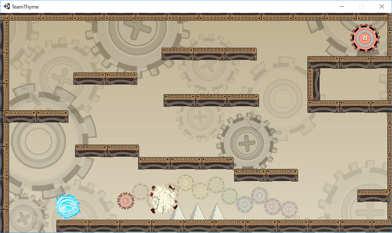
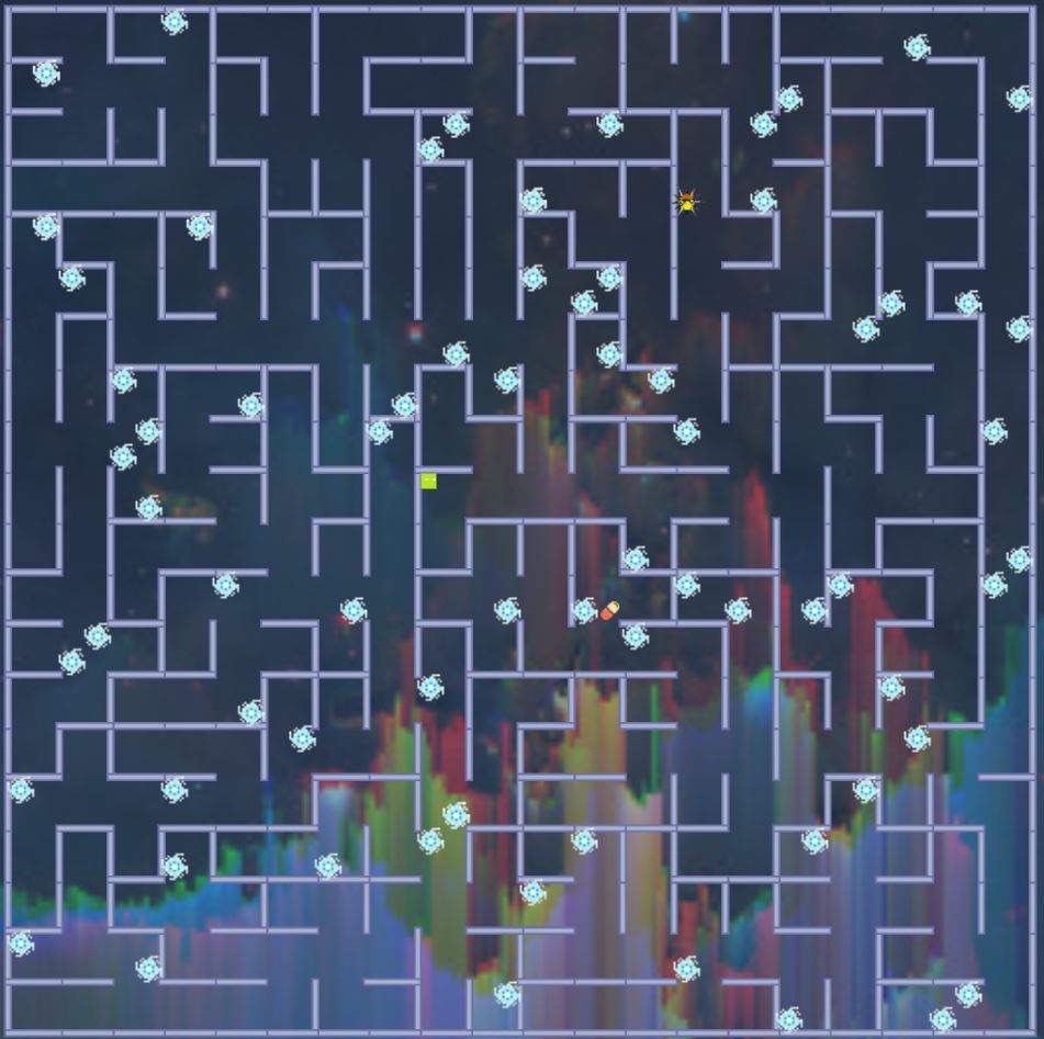
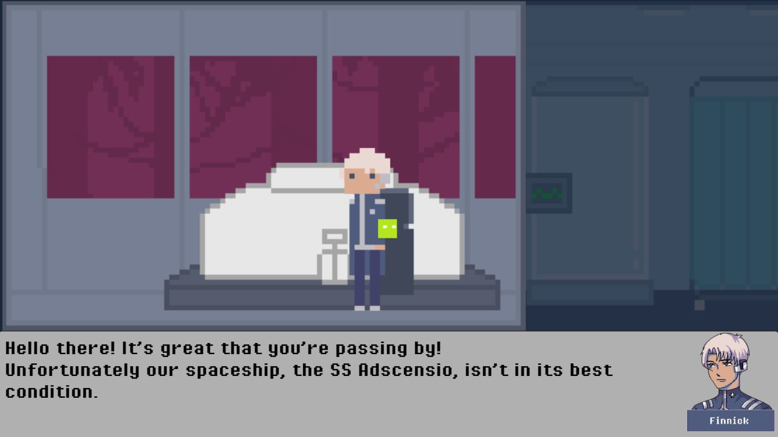
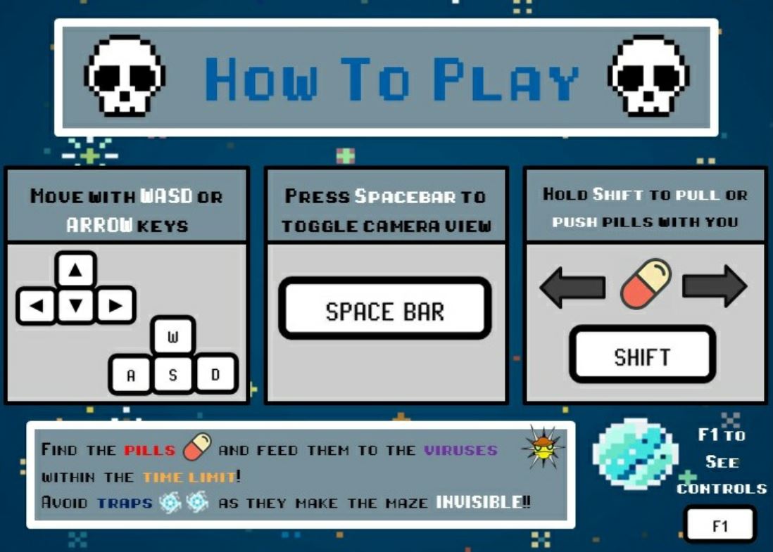
Adscensio is a Sci-fi platformer story-based game created with Unity.
You take on the role as someone who has been sent to the spaceship SS Adscensio to help out the few people stranded on the abandoned spaceship. As you help them provide aid to the survivors, you learn about their time on the spaceship and the experiences they went through.
Contributions and Takeaways
Adscensio was created for my Game Design project in NUS. My role was the Prototyper and Game Level Design Lead. I've learnt many different game design concepts and how it would affect the emotions of the players. I enjoyed crafting the storyline for this project.
Adscensio contains elements of replayability, puzzle-solving game and different levels of difficulty.
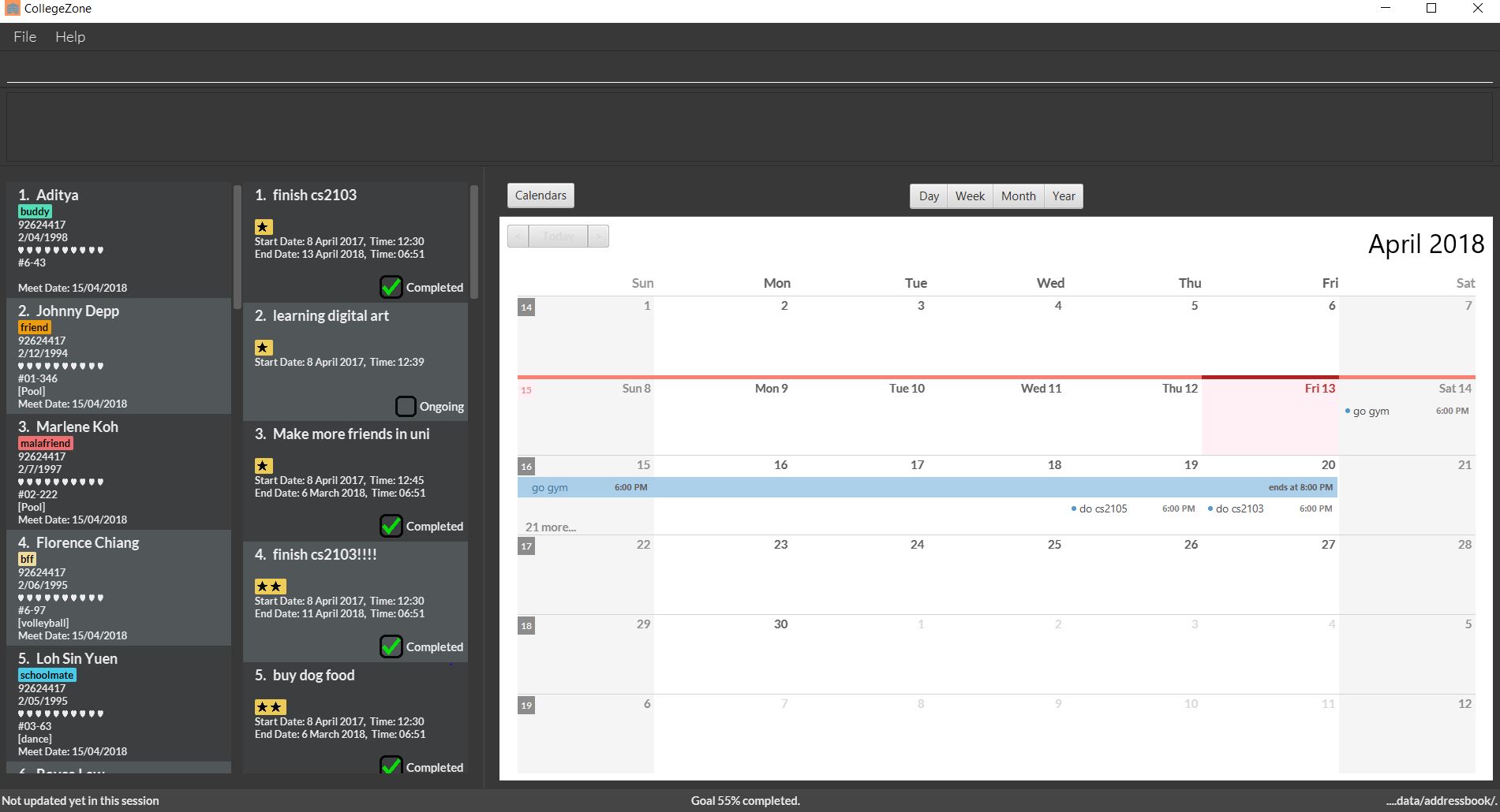
CollegeZone aims to be your personal assistant to help you with daily school activities during your stay there.
It is a revolutionary desktop application created for National University of Singapore (NUS)
students living in Residential College 4 (RC4). We aim to help you to manage your hectic University life!
CollegeZone helps you to maintain and expand your
social circle, tells you the goals you have, and schedules reminders and appointments you have. More importantly,
CollegeZone is optimized for those who prefer to work with a Command Line Interface (CLI) while still having the
benefits of a Graphical User Interface (GUI). If you can type fast, CollegeZone can get your contact management and
tasks done faster than traditional GUI apps.
Contributions and Takeaways
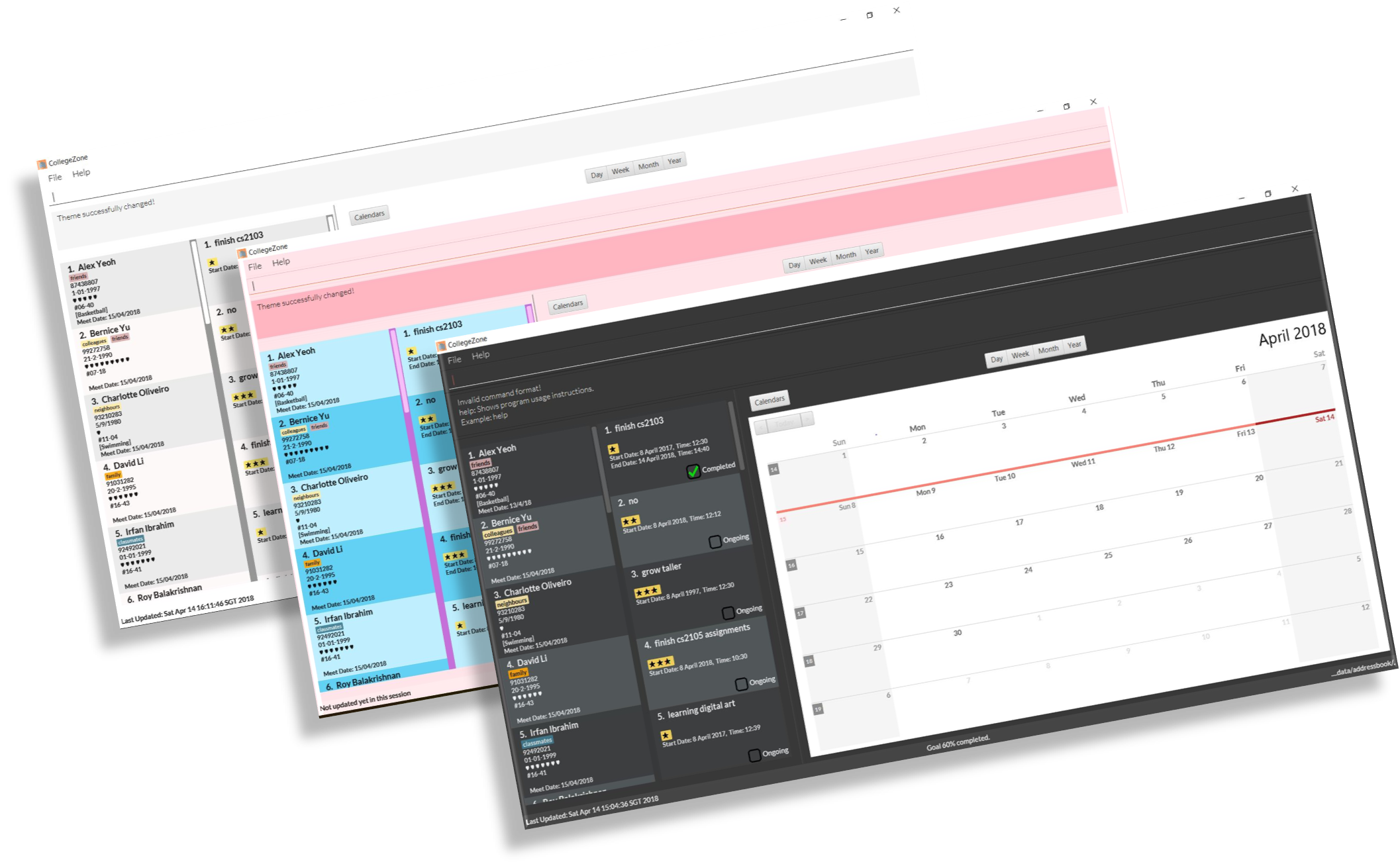
CollegeZone colour themes
CollegeZone was my first Software Engineering project in school. For this project, we started to gather and specify requirements for our target audience.
I got to create user stories on for our target users. The user stories describes the type of user, what they want and why.
Next, based on the design architecture and patterns learnt, I implemented several features related to the Goals portion in CollegeZone.
I applied Quality Assurance practices on my implementations to ensure that they were working as intended.
I was also the sole designer for the GUI of CollegeZone. I ensured that CollegeZone had an appealing and responsive User Interface.
When choosing the different color themes I could design for CollegeZone, I researched and found out that Light and Dark themes were the most common themes that users preferred. Therefore I
decided to add the flexibility of switching theme colours in CollegeZone. Light, Dark and Bubblegum theme were the 3 themes I used!
Click
here to see a seperate portfolio about my contributions to this project!
SKILLS
JavaJavaFXSoftware Engineering PrinciplesCSS
Interested? Click on the button below to check my Github repository on this project or click the download button to download this application. Enjoy!
For my interaction design project, we researched on a concept to allow easy creation of digital music and to visualize it. The whole process involved ideation, defining the problem, user research, prototyping and testing.
TOOLS
HTML/CSSJavascriptInVisionBalsamiqAdobe XD
SKILLS
Web DesignUser ResearchUser TestingPrototyping
The Problem
Everyone enjoys listening to music, however creation of electronic music seems too tedious with the various complex and expensive softwares out in the market. Music mixing devices (music controllers) such as the MidiFighter and Launchpad are also used in tandem with these digital music softwares. However, music controllers are pretty expensive.
We want to improve the accessibility in creating digital music – how can we provide a similar service to people at a low cost? How can we reduce the learning curve required to create digital music?
We looked at various sound kit websites such as Mikutap and Patatap, that allows creation of music along with visuals.
The Solution
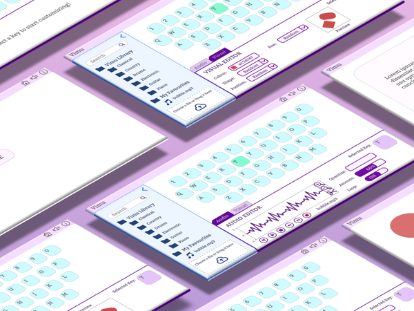
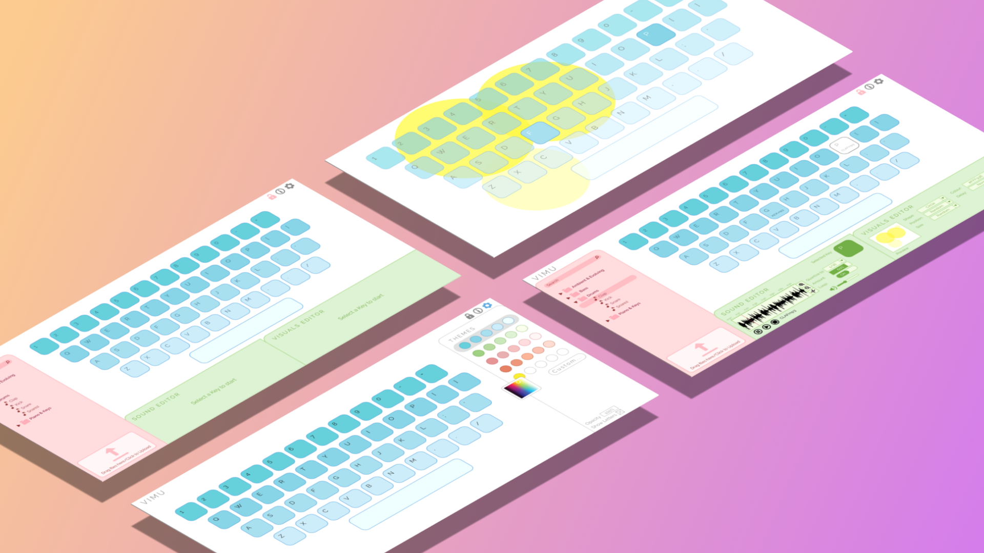
We designed Vimu, a visual sound kit and music editing website that improves the learning for users who are new in creating digital music. We also included the visuals in Vimu as we uncovered from our user research that many would like to create visuals with music for live performances.
Key features of Vimu:
Customized music files
Vimu offers the flexibility for users to import their own music files in addition to the pre-existing Vimu sound library
Keyboard Controller
The keyboard is now the user’s controller. The user is able to customize sounds and visuals to keys.
Customized Visual Music
The user is able to create their own customized music and visual product.
Music Editing
The user is able to edit their music through Vimu.
The Process
User Research
To design Vimu well, I needed to understand why our target users would use it. How can Vimu help them with their learning on music creation?
What would keep them interested in using it regularly? What pain points can we get from them?
How can it appeal to others too?
We scoped our product and designed it to cater to NUS Electronic Music Lab (EML) members. EML is a music performance group that creates, performs and promotes original electronic music. EML members typically uses Ableton as their software in creating Electronic Music.
We conducted several Semi-formal interviews on the NUS EML members – both new and experience music creators.
We needed to learn more about our potential users’ behaviour and their experience with both music editing softwares and hardwares. During the interview, we wanted to know the pain points they experienced during the music creation process. We also introduced them Mikutap and asked for their feedback on it.
From our analysis, we found that new music creators:
Dislikes the learning curve of software that EML uses - Ableton Felt that controllers were too expensive, albeit nice to use Liked Mikutap but wanted to be able to customise and edit their music
From our analysis, we found that experienced music creators:
Ableton has difficult UI and offers too many features Took very long to learn Ableton Finds it difficult to set up their music controller Liked Mikutap but are comfortable with Ableton Felt that Mikutap has visuals that can be used in live performance
We learnt that the fact that Mikutap does not support mapping of local audio, as well as recording/downloading the song composed, makes them unwilling to use it.
This would limits the creativity of music creators as they are now restricted by the default sounds available to them.
We learnt that we were able to design Vimu to suit both types of users needs.
We decided to design our Vimu prototype that addresses these issues by:
Keyboard as controller Allows customization of music - supports editing & importing Music library Allows customization of visuals Intuitive user interface
Ideation
Vimu has 2 different target audience - new music creators and experienced music creators. We plan to create a web application that allows users to easily map local audio to keys on the computer keyboard and mix music using the keyboard.
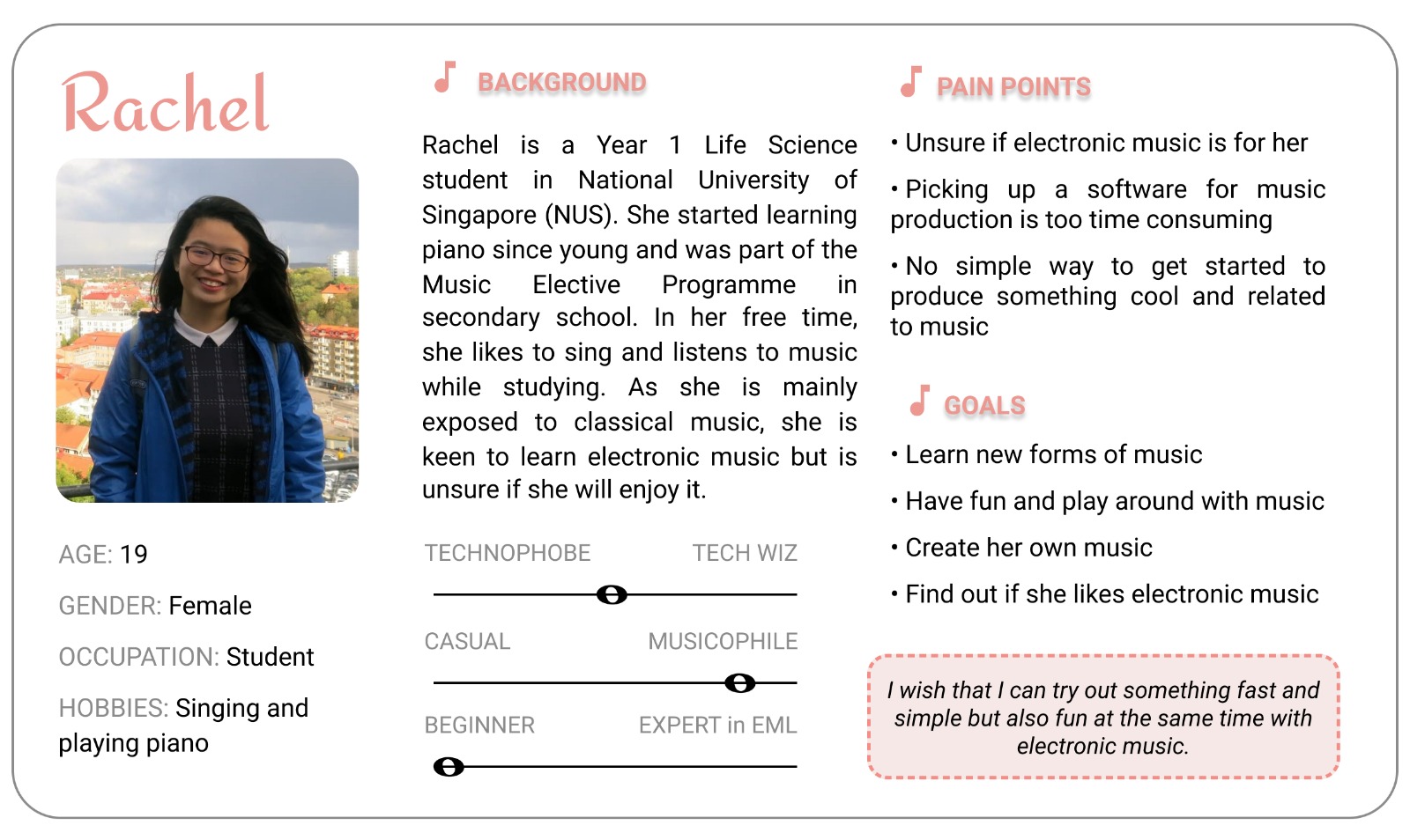
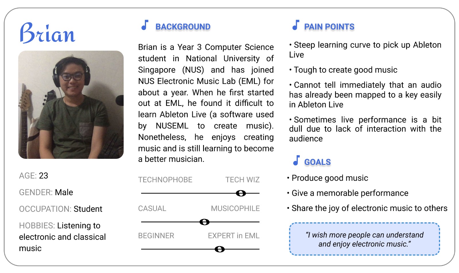
We designed Vimu for Rachel and Brian, our 2 personas.
Persona 1 - RachelPersona 2 - Brian
Xin Ler synthesized the results from our team’s research to create Rachel and Brian!
Rachel is a NUS Freshman who has a background in music. She wants to try composing electronic music but doesn't want to invest too much time and effort in the process.
Brian is an experienced music creator who had a hard time learning Ableton. However, he enjoys what he's doing now and
Our group members split up and designed the first iteration of a Vimu prototype individually. The reason behind doing this is to uncover the different designs each
of us have for Vimu and weigh the Pros and Cons of each one.
With a greater understanding of who I was designing for, I created a problem statement to address Rachel’s and Brian's needs:
Rachel wants an easy way to pick up the skill of composing Electronic Music, but there isn't an easy way to do this.
Brian on the other hand wants a way to create visualizations using music he created from a familiar software (Ableton) instead of outsourcing the visualizations from third parties.
How can we strike a balance in designing Vimu for both Rachel and Brian?
How can we design Vimu as a better option in learning Electronic Music over Ableton, so that Rachel would be more inclined to use Vimu?
How can we find a solution for Brian to create his own visuals in Vimu and have a better experience compared to Ableton?
The goal was to create Vimu for Rachel and Brian to enjoy using it, to have important features that Ableton has and to create visualizations for performance.
We wanted Vimu to be an enjoyable platform for both Rachel and Brian to use.
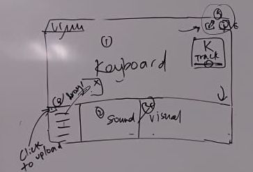
I created my first prototype that addresses all issues uncovered in the user study. I focused on several specific topics:
Sound Library
Navigation
Visuals
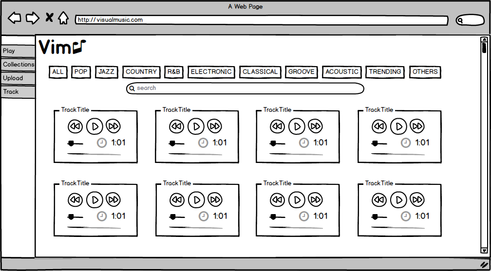
Sound Library
My Solution:
I wanted to create a sound library that users can easily play, pause and replay the music to search and find the suitable sound they need. I also added multiple genre tabs for the users to access genres easily.
In addition, I wanted the genre hot tabs to update based on the user preferences.
My-lo-fi Sound Library
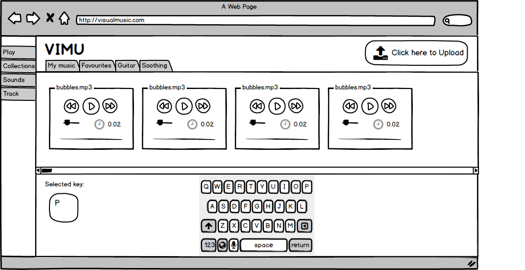
Layout
My Solution:
I designed a vertical tab for users to navigate throughout Vimu and a horizontal sound tab for users to navigate throughout their music library.
The vertical tab consists of: Play - the page where users can play music and visuals from their keyboard Collections - Collections of Vimu's Sound Libraries Sounds - Where users map the keyboard keys to the sounds Track - Where users can edit sound clips at - I chose to keep all the important editing tools that Ableton has which was brought up by users during the user study.
The keyboard is located at the bottom and the key mapping is displayed on the left hard corner of the keyboard.
My-lo-fi Layout
Visuals
My Solution:
I created a visual prototype with JavaScript, where upon pressing of a key on the keyboard, a short sound clip and simple shapes with random colours are visualized on the screen. You can see a short clip of how it looks like in the video below. Remember to turn the volume up!
Evaluation
After we each came up with our lo-fidelity prototypes, we all weighed the pros and cons of each of our prototypes. In the end, we decided to follow Yee Ru's prototype layout and design, as it is more visually appealing, has good web layout and the key elements for Vimu were represented well.
We came up and drew our new prototype, as shown below.
New Vimu prototype (Layout of Yee Ru's prototype)
We decided to adopt a large on-screen keyboard display. It is essential as the users will be interacting with it directly.
We also adopted a single page layout to make this web application make simple, where Rachel and Brian can navigate around our app easily.
Each of us then got the opportunity to redesign the Vimu page based on this layout that we have chosen. This was the most exciting part as this allows us to unleash our creativity in our design!
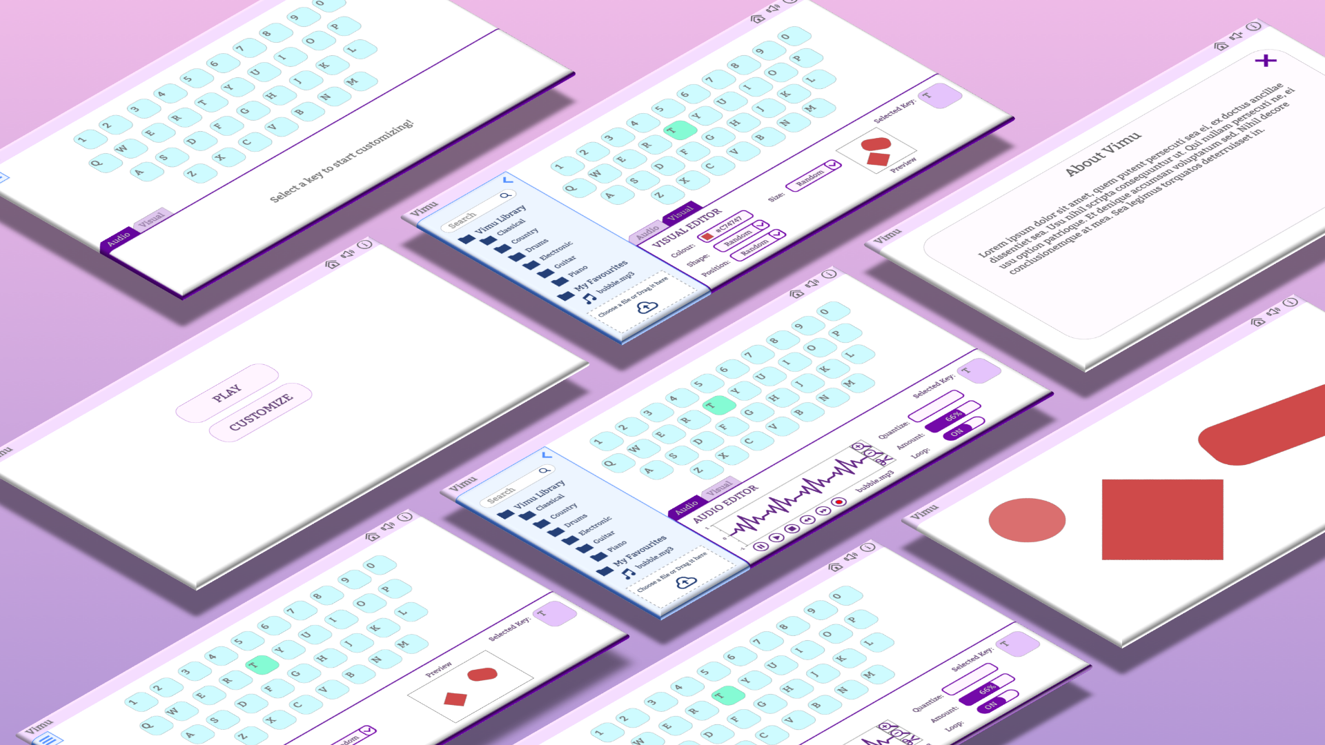
My Vimu prototype uses the colours purple and blue. More details were added such as the Audio editing tab and Visual tab.
I realised that my original lo-fi prototype violated several of Nielson's Usability Heuristics as compared to my current hi-fidelity prototype.
My Vimu Hi-fi prototype
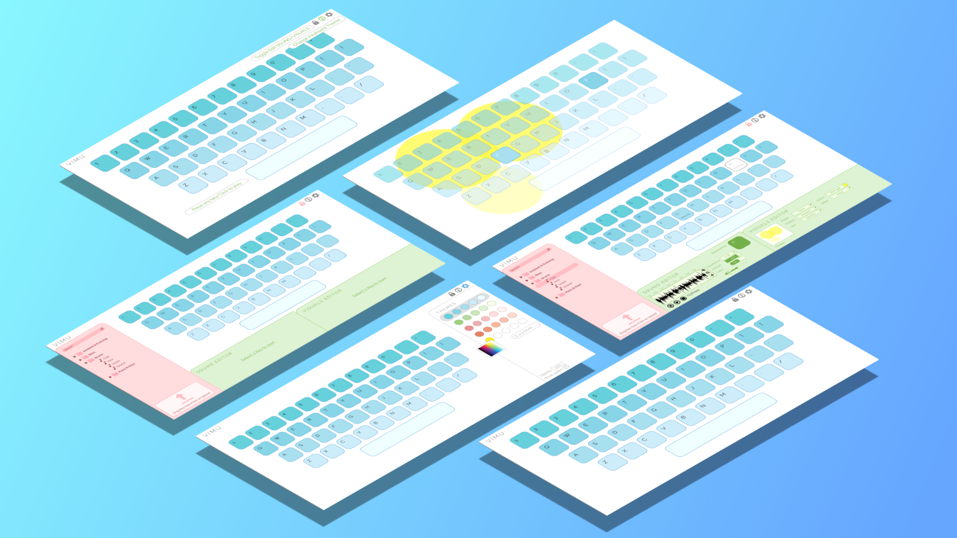
After another round of evaluation, we decided to use Marlene's hi-fidelity prototype as it has a much cleaner interface and interesting colour scheme.
Final Vimu Hi-fi prototype (Marlene's Prototype)
User Testing
We conducted usability testing on 6 different target users at different stages of our Vimu prototype. We gave a brief introduction about our Vimu website to them followed by a list of task that they were supposed to do. The Retrospective Think aloud method was used during this usability test.
The purpose of this usability testing is to better understand how our target audience interact with Vimu and to improve on our design based on the results.
After getting feedback and bug reports from users, we constantly updated our prototype, fixed issues and asked another user to give their feedback on our revised prototype.
We measured the Usability Testing results by evaluating the number of successful task completions, Critical and Non-critical errors occurred, Error rate measurement and Test level satisfaction. We used the System Usability Scale (SUS), a popular questionnaire, to measure their overall impression of the usability and experience.
Overall, many users felt that Vimu is user-friendly and we had positive reviews regarding the ease of use of our system. From the results, it seems that new users are likely to continue using Vimu as a toned-down substitute to Ableton.
Our Design: The Successful Aspects
Users were able to immediately know that the keyboard has to be used just by looking at the home screen.
Icons were recognizable to all the users
Users recognized how to customize visuals and audio in editing mode.
Users were able to successfully carry out the tasks. This implies that our website has an intuitive and simple layout.
Our Design: The Unsuccessful Aspects
Deleting Function: We realised that almost all of our users tried to click the “delete” key in an attempt to delete visual and audio mappings to a certain key. Maybe the drag and drop function isn’t intuitive to them.
Export function: We found out that some users would want to export their edited sound clip out as an audio file. We also realised that it is a pretty important function given that our target users are members from EML, and they may want to reuse the edited sound clip on other music editing platforms.
Takeaways
It was definitely a difficult task on a topic that I wasn't familiar with - Music. I had to do a lot of research on my own to better understand this topic. I felt that my first mock up prototype
wasn't a good design, but I've definitely learnt from it. It was an eye opening experience to see that all 4 of us (me and my groupmates) had many different elements and layouts when creating our first prototype. I learnt the importance of user-centred design and usability in the designing of of Vimu.
However, it was really rewarding to see our final product.
Interested? Click the invision button below to check out my invision prototype that I made and click on the Github button to check my Github repository on this project. Enjoy!
For this UI/UX case study, I researched and evaluated Singapore’s Healthy 365 mobile application. Through this process, I analyzed the current application’s User interface based on Nielson Norman’s Usability Heuristic and conducted user research on it. After the research, I designed a more user-friendly version of the current Healthy 365 mobile application based on the insights I’ve found.
TOOLS
Adobe XDInVisionBalsamiq
SKILLS
DesigningUser ResearchUser TestingPrototyping
The Problem & Understanding Healthy 365
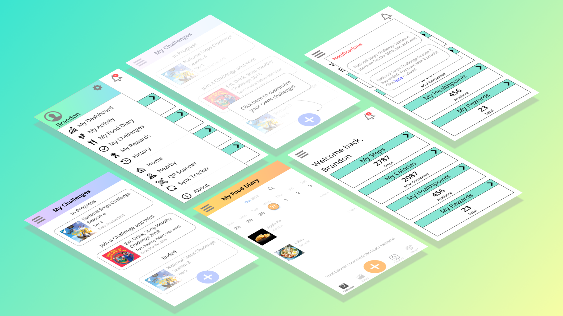
Healthy 365 is a Singapore health and diet mobile application developed by the government organisation, Health Promotion Board (HPB), with the aim to promote healthy living in Singapore. A unique feature that Healthy 365 offers is rewarding users who participates in local Health Challenges featured in the application by accumulating points and redeeming rewards.
Due to the marketing of the nation wide National Steps Challenges, healthy 365 has received more than a million downloads in Singapore. However, the app has been met with poor reviews on the app store and has been met with many complaints from Singaporeans.
I want to create an enjoyable experience for the users - to make activity and diet logging fun for the users.
Understanding the Target Audience
To better empathize with the users, I examined several healthy 365 users and non-users through usability testing using the think-aloud protocol. I had the users to use the current Healthy 365 mobile application, asking them to think out loud as they perform a task, and interviewed them to understand the painpoints and thoughts behind their actions. I gathered qualitative feedbacks while consolidating quantitative data to identify trends and patterns in our user. Here are some of the notable user quotes that formed a pattern in my research:
“The tutorials are so long .. But if I did not watch the tutorial, I would have no clue what this page meant to me.”
“ Why are there so many advertisements on the Challenge on the Home Screen?”
“I probably will never use this app due to it’s bad design, it’s ugly, confusing and the contents in it is poorly categorized.”
“I tried participating in the National Steps Challenge once, however I lost motivation after a week and stopped.”
“The icons are misleading. Shouldn’t the bell icon represent notifications instead of messages?”
The healthy 365 app has a lot of functionalities, even current users admitted that they only use a certain functionality it has to offer. Users have a hard time seeing and navigating the Healthy 365 app as it's full of information and notifications/advertisements that doesn't close. This makes it complicated for the users to figure out on how to use the app.
Furthermore, the icons were misleading - users were clueless about unlabelled icons.
Evaluation
I evaluated the app using Nielson Norman’s Usability Heuristics along with the insights I’ve uncovered from the user study.
Below shows some of my findings:
Non-intuitive & unrecognizable icons Not aesthetically pleasing - poor layout Difficult for users to carry out a certain task - too many clicks Navigability issues - difficult to carry out popular/important tasks
I decided to create a prototype that addresses these issues by:
Using clear icons Improved design layout Easier navigation to popular/important tasks - reducing cognitive load on users
Ideation
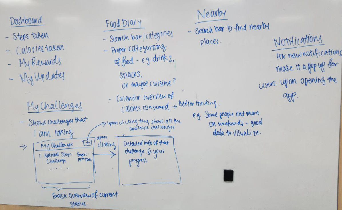
When redesigning the UI for Healthy 365, I focused on specific topics:
Navigation (the idea of moving around healthy 365 app)
Information Location (relocating information)
I kept in mind all the pain points the users experienced and came up with a 2 mock up layouts.
My Mockup 1My Mockup 2
Navigation
Current Design:
Healthy 365 uses a tabbed-navigation bar for main navigation throughout the app’s page. Users has to swipe left multiple times to view all the navigation options.
Healthy 365 current tabbed-navigation bar
My Solution:
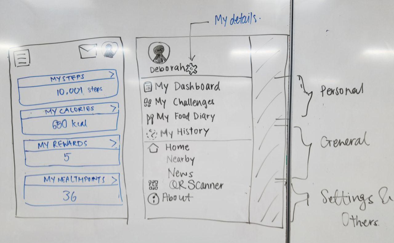
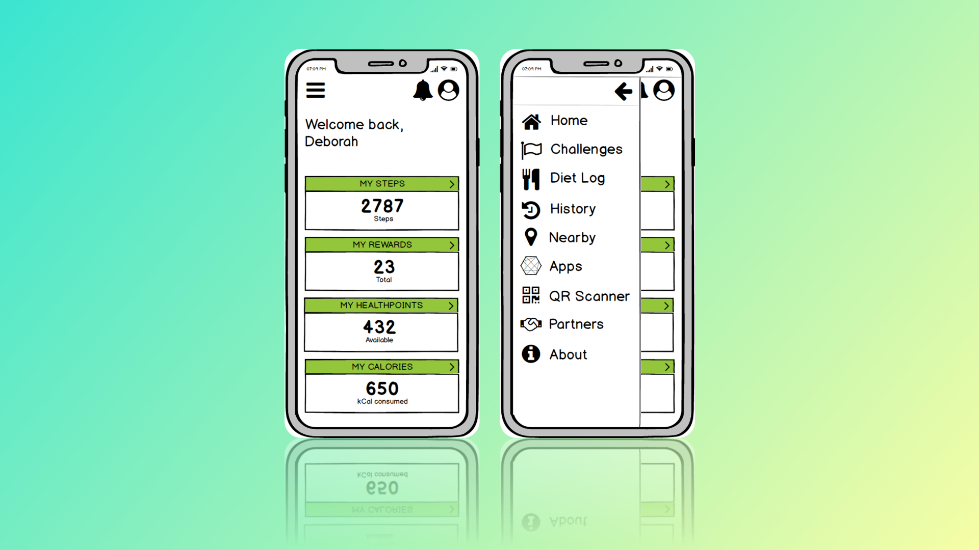
I decided to use a Hamburger menu for a much cleaner app and to handle the vast amount of navigation options Healthy 365 has. Users are able to see the whole list of navigation options available with a single swipe. I used recognizable icons and labelled icons where needed. This makes it easier for the users to understand what the icons mean.
My Hamburger menu design
Information Location
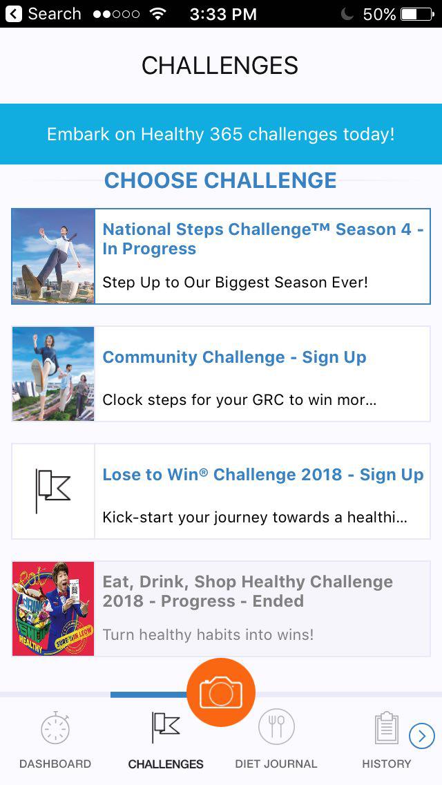
Current Design:
Hard for users to find the information that they need. An example is the poor distinguishing of Challenges status. The 3 different status - Challenges that users has not signed up for, that are currently in progress and has ended.
Healthy 365 current Challenge page
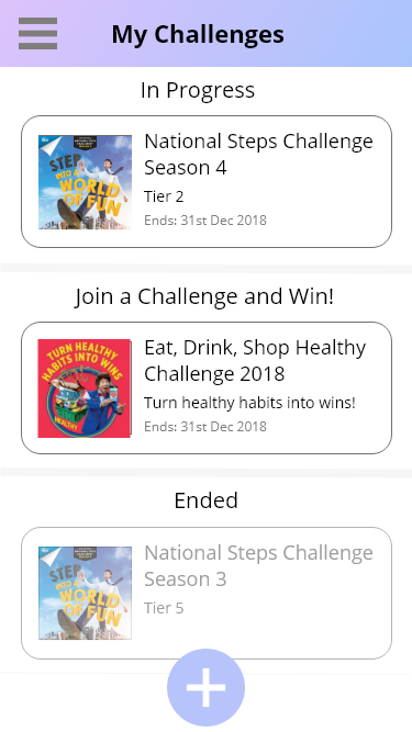
My Solution:
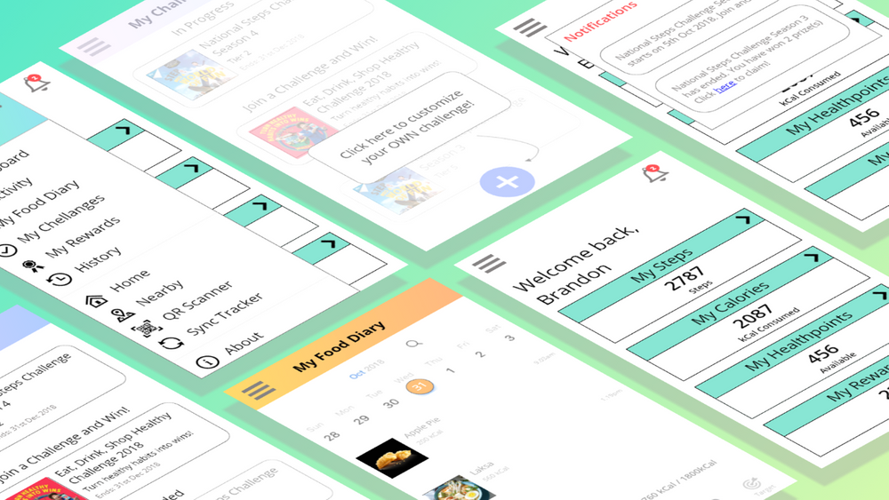
I created a “My Challenges” page for users and have a clearly distinguished challenge status along with their current Tier for that Challenge (current ranking). This makes it much easier for users to find the information they need. In addition, I decided to relocate information such that it doesn't block the view of the users. For example, instead of having persistent advertisements of challeneges that blocks the important user dashboard information, I relocated it into the notification icon (bell icon).
My Challenge page design
Others
I revised Healthy 365’s food diary feature so that users can log their food more intuitively. It's now much easier for the user to scroll through their past meals and have an overview of his food diary statistics.
Personalization of the application was also an important factor I considered to meet the needs of the users.
My Hi-Fidelity prototype layout
Usability Test
Once I got my prototype ready, I conducted usability testing with it. You can try out my prototype below!
Based on 5 usability sessions on my prototype, users were able to navigate through app easily to find what they were loking for. Some also mentioned that they would prefer to use my version instead of the actual app.
The users mentioned that:
“The interface of this is much better, it's so much easier to use.”
“I am able to find what I want more easily.”
I succeeded in achieveing the main goals I had - to make it more usable for the users!
However, there were still some shortcomings about the prototype - that it still wouldn't be something they would use regularly. My prototype definitely has room for improvement. Nonetheless, I was happy that users liked it.
Takeaways
It was definitely a difficult task conducting a UI/UX case study alone. I do not get another person's input when designing the prototype.
I enjoyed conducting user research for this case study - I get to see so many different views and different types of usage that users use the Healthy 365 application for.
However, it was really rewarding to create a solution to a problem on my own.
I got to navigate almost all of the UX process solo and learnt my strengths and weaknesses along the way.
I got to design something that I'm proud of, a product that would make users happy when using it!
Interested? Click the invision button below to check out my invision prototype that I made for this project. Enjoy!
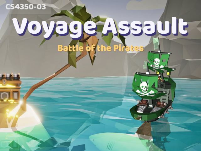
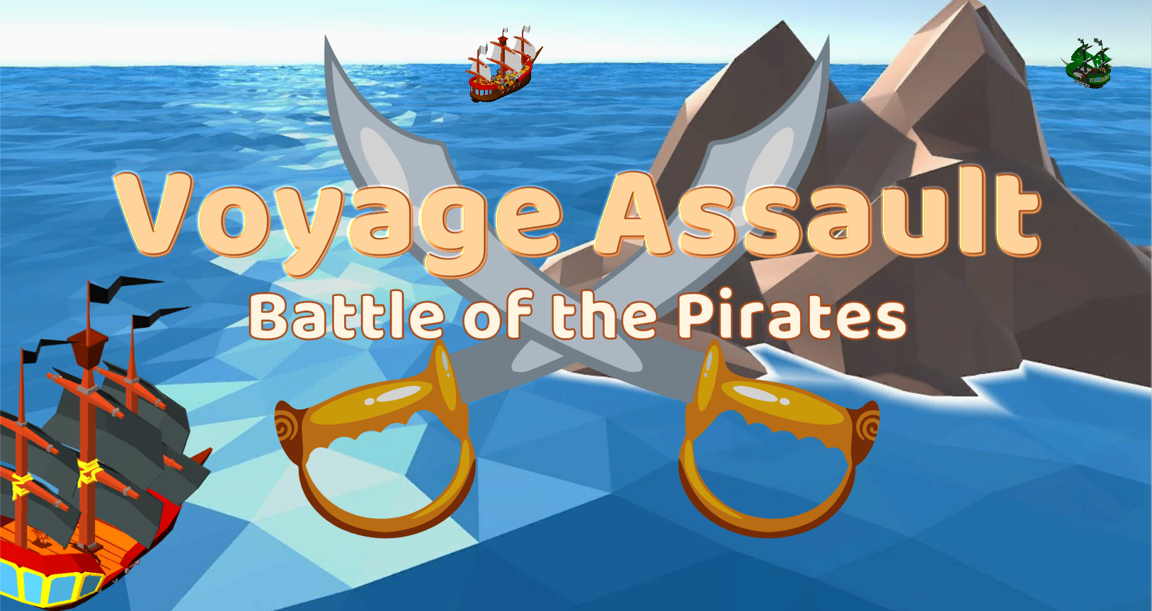
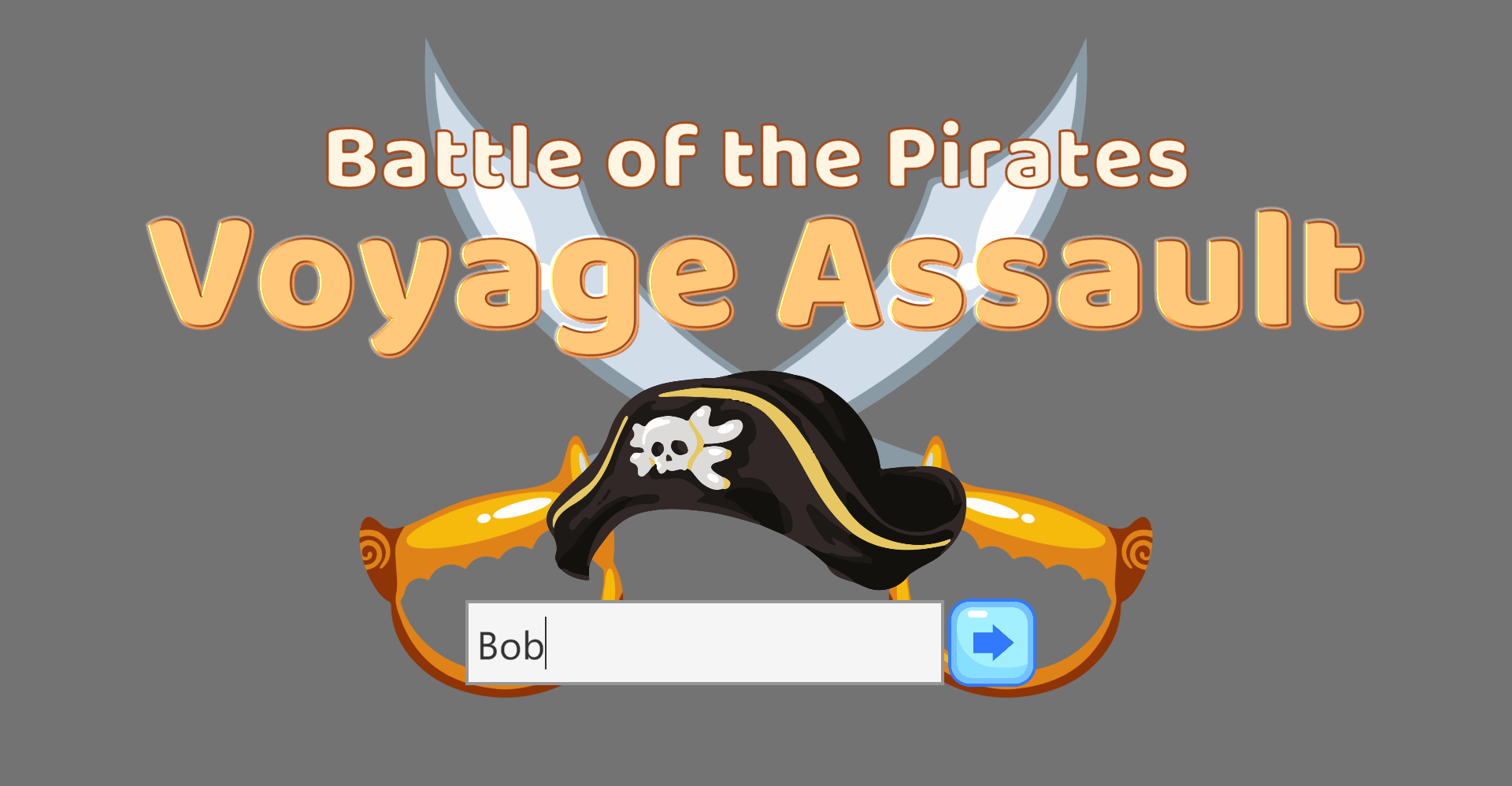
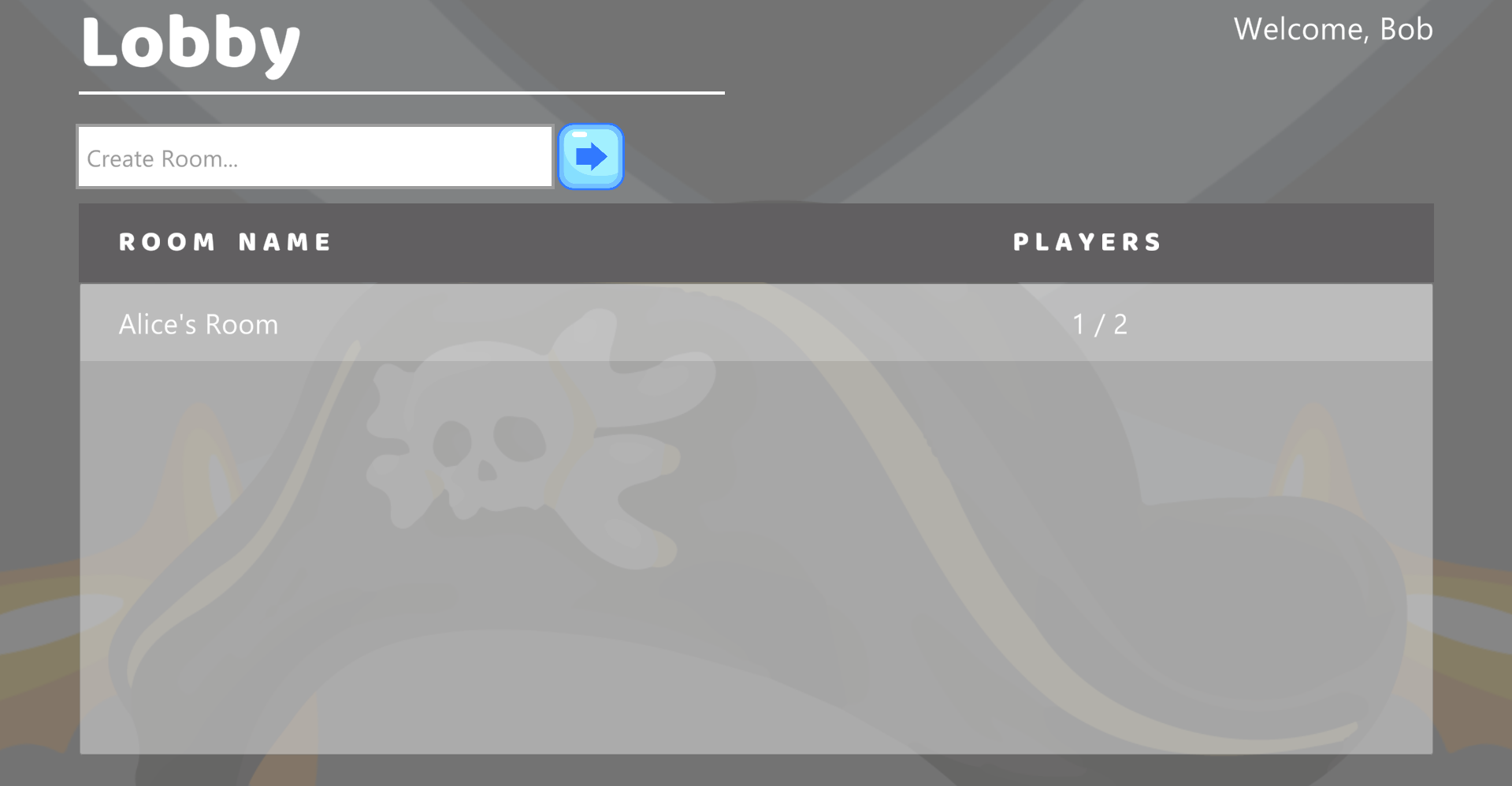
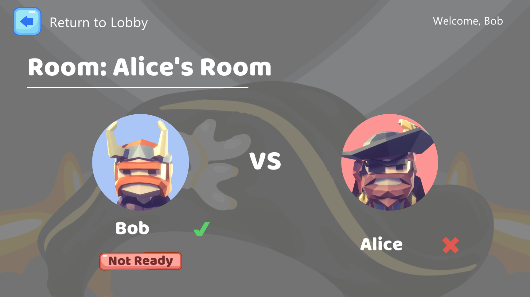
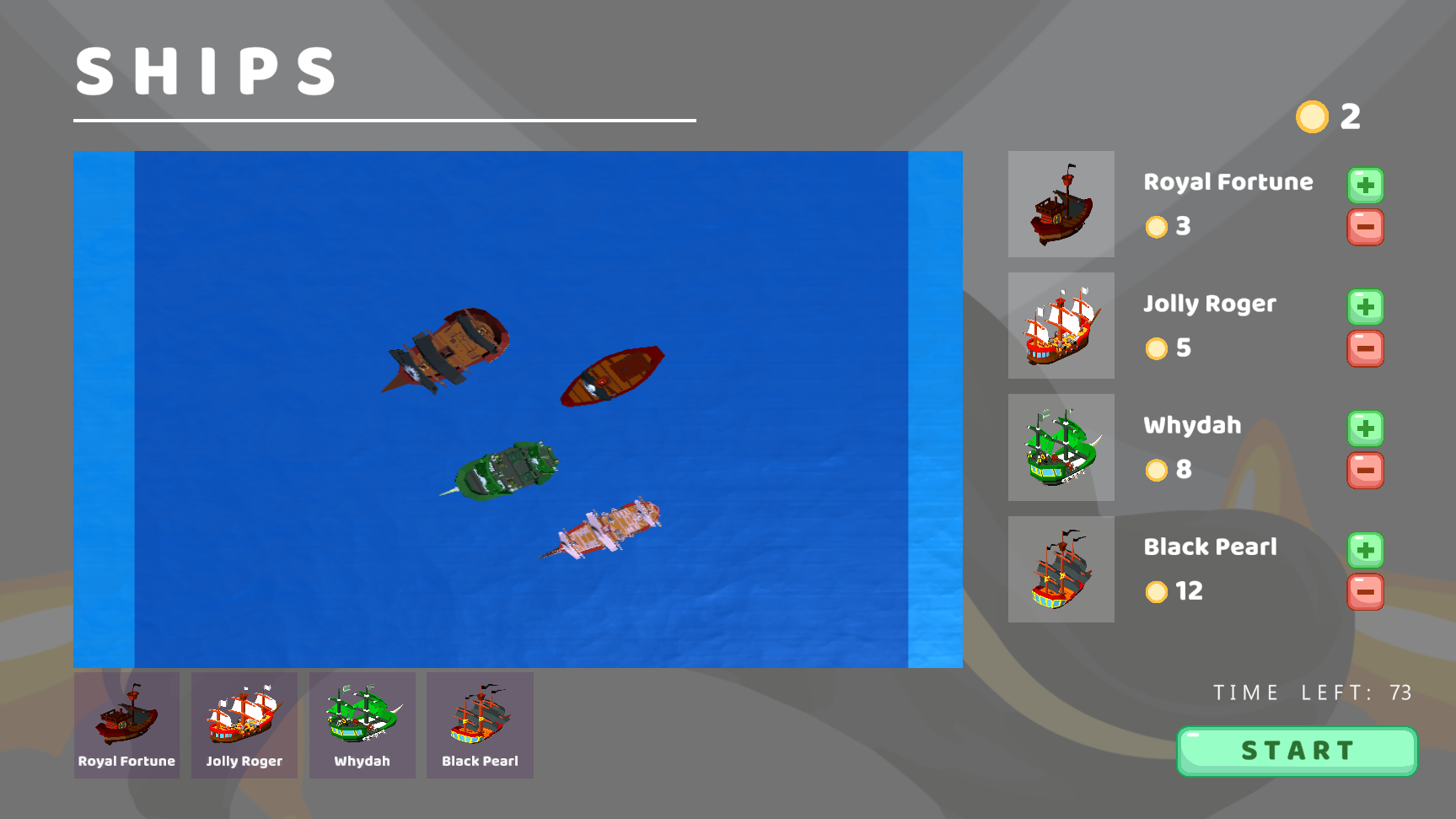
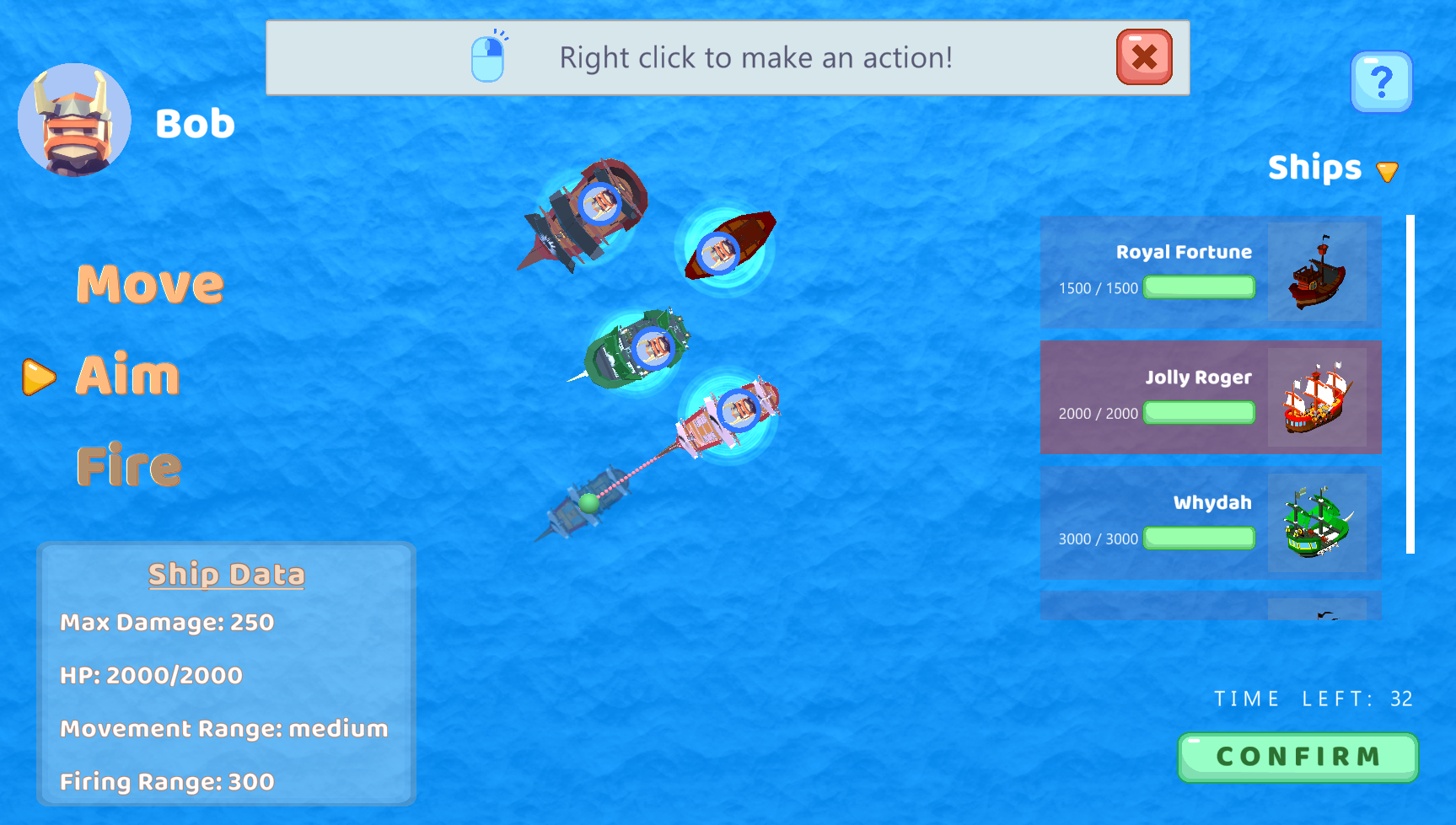
by Deborah, Marlene, Joshua, Liu Rui, Xing Kai, Hung and Lingshuo
About
Voyage Assault is a 2 player PvP game that takes place in an Ocean arena. Battle against each other as pirates, with your fleet of pirate ships. Steer, predict and attack your enemy! Players will battle out till a pirate loses all his valuable ships.